In Praise of Volkswagen
There’s one company that has always made nice vehicle cabins—and if you read the title of the article, you’ll have already guessed that it’s Volkswagen. From one era to the next, the German brand has consistently kept up with trends while enhancing its vehicles with an added touch of refinement—even if it wasn’t the norm at the time, and even if several automakers still don’t go the extra mile with their vehicle interiors.
Volkswagen has always skilfully clustered controls on stylish dashboards, without going over the top. But what does a nice layout look like?
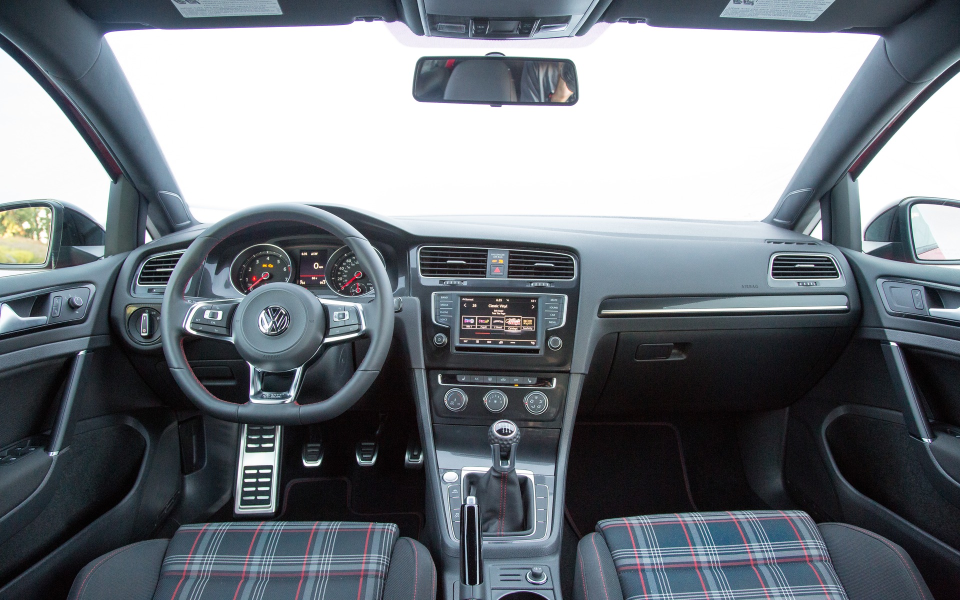
Let’s look at the cover photo. It shows the interior of a 2017 Golf GTI. The first thing you’ll notice is that the dashboard was designed with the driver in mind, as evidenced by the way it’s all arranged. In the middle, there’s a digital screen that’s neither too big nor too small. Below, the climate control buttons are grouped together in a single place. This layout leaves little to the imagination, which means that you can find the controls quickly when the need arises.
However, not all German brands meet this standard. Take Porsche, for instance. Even though Porsche vehicles have attractive interiors, the buttons tend to be located in strange places. In the Porsche Cayenne, myriad buttons are clustered around the shift lever, seemingly at random. Here’s the control for the suspension firmness, there’s the control for the heated seats—but you’ll have to look behind the steering wheel for the button to heat it. In short, it’s not exactly intuitive.
This makes us appreciate Volkswagen all the more. The brand has managed, in recent years, to strike the perfect balance between design and functionality. They’re setting the example for others.


